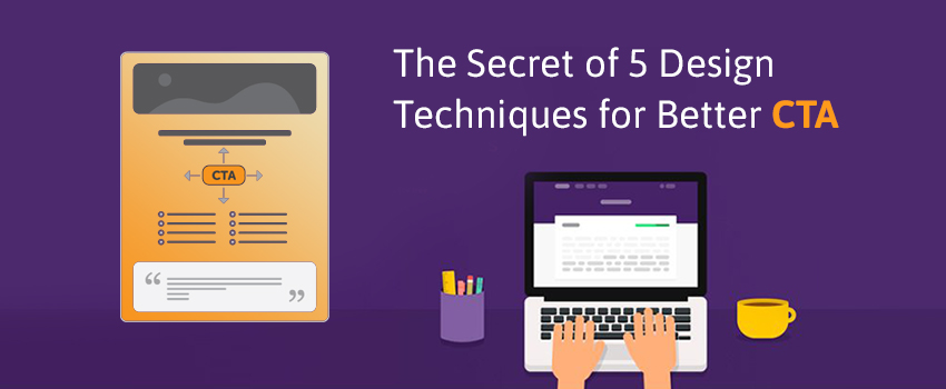
The Secret of 5 Design Techniques for Better CTA Buttons That no One is Talking About

There is always a first step to everything we do. While we search something on internet we have an initial step for that too. Be it a goalless toggling or a meaningful search we are always initiating things with CTA. The word CTA stands for call to action. In the following article we will enlighten the fact that there can be like 5 designs which are not used so often which could give a better CTA.
With many other things, website Development and Web Design Company in Bangalore, is known for the best IT based outputs. They are very much experienced and have a good panel that controls the work effectively and efficiently. Let’s just see the 5 secrets of design techniques for better CTA.
- There always is a way that is colorful which catches the eyes. It is one of the most important and factor that one should keep in mind and this can create a lot of traffic for you and your website. Therefore, you should consider the color of your CTA button. This will make your audience keep coming to you.
- You always keep in mind about the action oriented text, if you were to take my views on this point then, on a serious note I would say that action oriented text has been not used frequently but yes it is very efficient. Nexevo Technologies somewhere or the other features this factor and they have always emphasized on this fact that text which are having some action is very effective and keeps the traffic going. Be simple and easy during writing your text.
- Make it visible without scrolling. This means that you should keep your writing precised and short. The write up should not be too long.
- Think about the design that communicates affordance, wouldn’t it be nice that you get the perfect way and shape to it. How will the users understand the constituent as a button? Use shape and size to make the part look like a button. This will be more presentable and more efficient while using, because we have that one thing called as attention that we have to seek.
- Keep in mind whatever you want your consumers to take the action; you’ve got to assist them, by eradicating all the possible problems from their way. When users are given too many choices, they tend to get confused. So, it’s better to offer the potential customers only one option.
Web designing in Bangalore is taken to all new level now; we have all the equipment and tools that are needed so there are no more problems that will utterly bring problems to you and your work. These are a few steps that I think will help you and will surely do the same if you think about it wisely.
Hence, if you had a problem lately regarding your output and if you will use these steps which are not often used will give you the best results.


